Fenech-Soler Triangle Website
As part of a rebranding strategy, the decision was made to simplify Fenech-Soler’s website and only maintain a basic holding page.
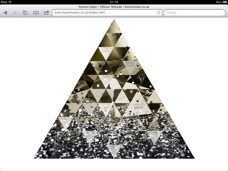
The new brand features a triangle made up of the band’s début album cover sliced into smaller triangles.
I sliced the image into numerous pieces and then re-assembled the image in Dreamweaver.
Some of the smaller triangles act as hot spots linking to the band’s online estate.
I used JQuery to animate the triangles when the user hovers over the them. Rolling your mouse over the hot spots will make the triangle fade out to reveal the link.
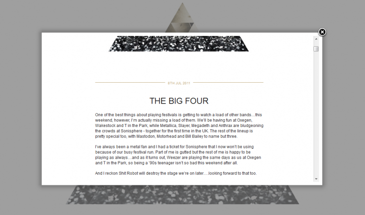
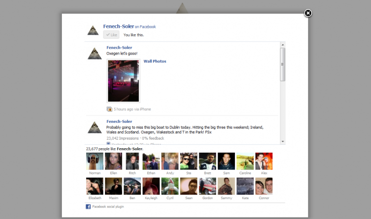
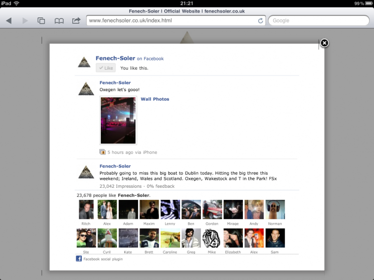
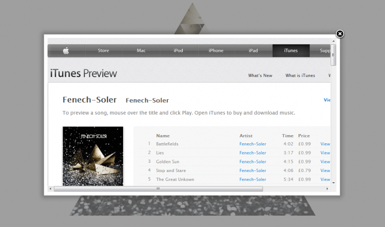
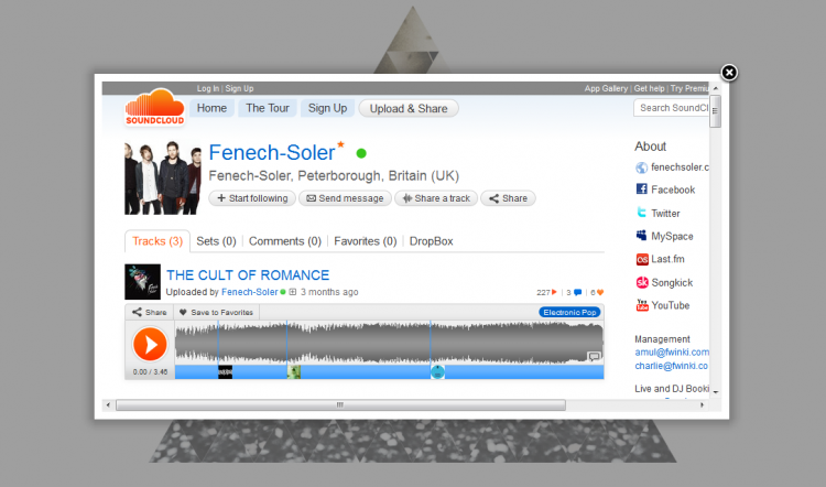
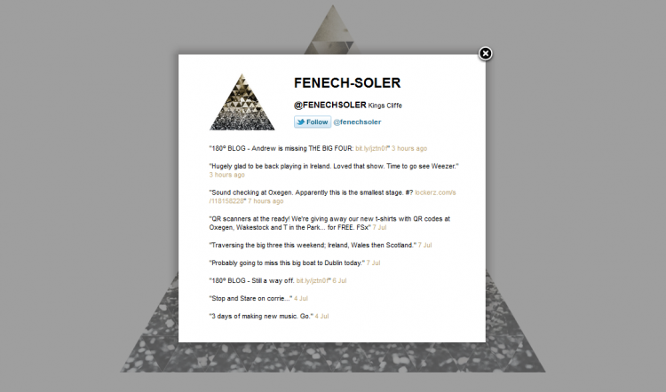
To keep the site more integrated I used the Fancybox library to open all the links in a lightbox iframe. Facebook and Twitter don’t allow iFraming so I built mini versions of the band’s profiles to display in the lightbox.
I used Remy Sharp’s JQuery Twitter feed to display the band’s latest tweets and also added a Twitter Follow button so that fans can easily follow the band from within the lightbox.
To integrate Facebook I included a Like Box with a feed taken from the band’s Facebook page. Fans can easily like Fenech-Soler’s page, view the band’s latest posts and see which of their friends are already fans of the band.
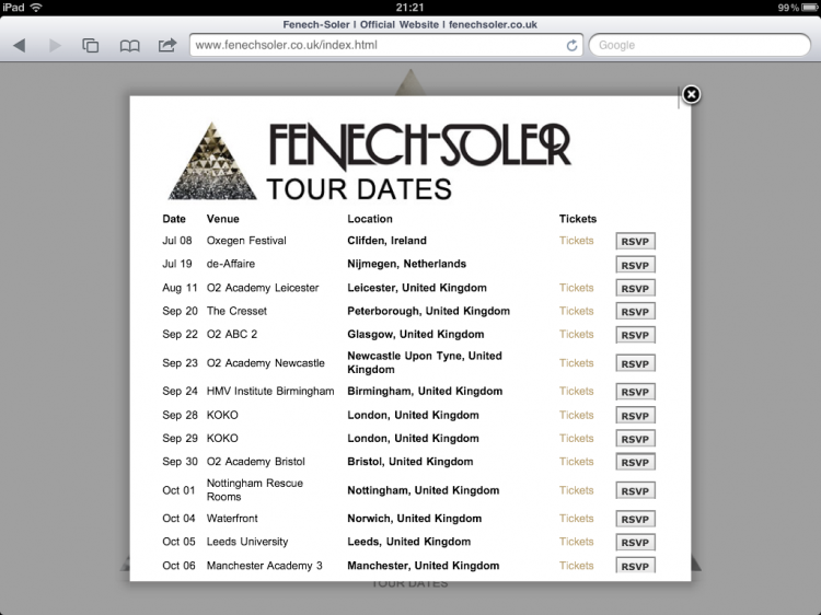
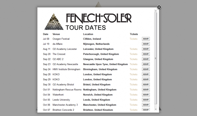
The Tour Dates pop-up is powered by BandsInTown, using Javascript to sync with the dates listed on Facebook and Myspace.
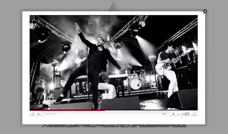
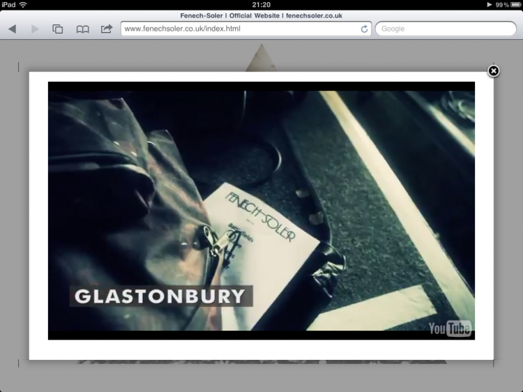
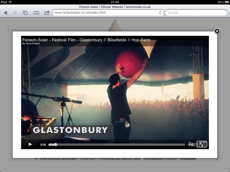
While Fenech-Soler are on the road doing an extensive festival touring circuit, they’ve had a film maker following them and documenting the shows. These videos are all hosted on YouTube but I added them to the website in a slick lightbox.
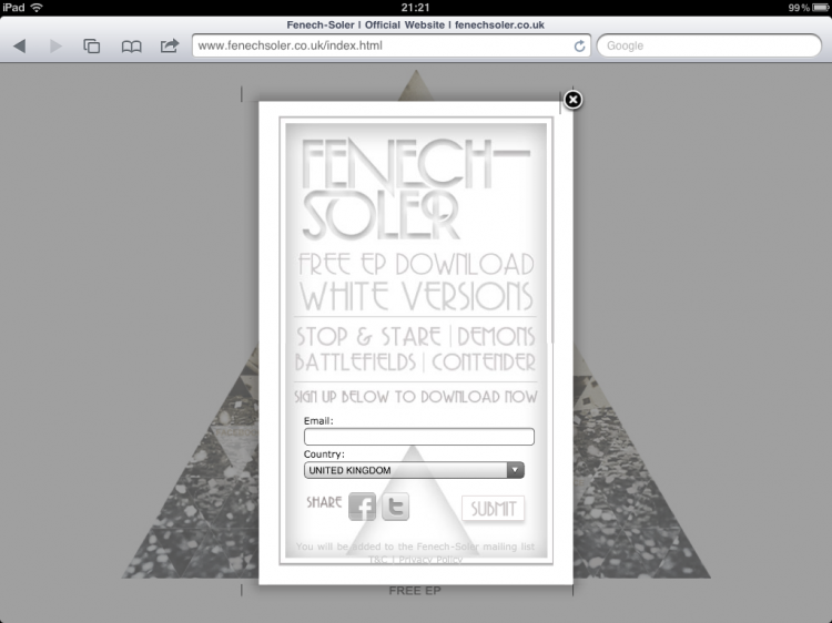
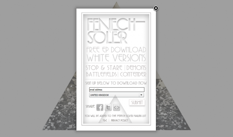
The page also links to the White Versions EP Widget I built some time ago. I made the widget pop-up in a lightbox and added a fallback version for browsers without flash support.
One major issue with a roll-over based page, is that mobile users don’t have a mouse to activate the rollover. I set the page to detect iPhone, iPad, iPod Touch and Android users and apply different settings to the page. All the hot spots are partially faded to start with, so that all the links are visible. Mobile users are greeted by the White Versions widget opened in a lightbox.

