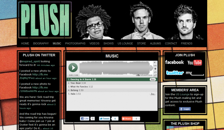
Official Plush Website
At the end of 2009 Brandon Prevost offered me a big freelance job; building a new website and online estate for Plush. I have been a fan and friend of the band since the early days of Native Noise on UCT Radio in 2003.
When we first started discussions around the new website I still worked at Communion / Beatroute. It was actually thanks to Brandon that I found out about my current position at Warner Bros.
Plush.us is built on the WordPress platform along with all the latest tools to enhance usability and engagement. It has been a while since I’ve created a custom Worpdress theme from scratch and the platform has introduced a number of useful enhancements. I started with twenty ten as a base and dug deep into the code to make it produce the high-end website I had in mind.
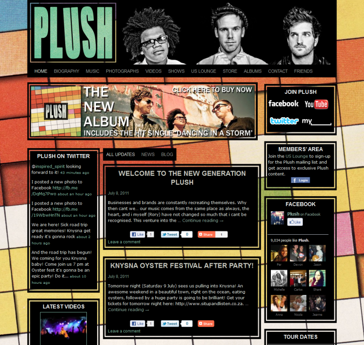
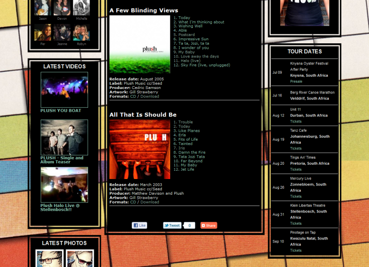
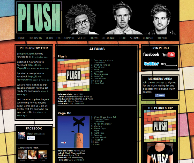
My design for the site is very clean and simple, based on the album artwork by Pierre Coetzee. I used the colourful background image as a fixed full-screen background and styled all the content boxes to have the same black background and border as the logo on the album cover. The header includes the new logo and a photograph by Deborah Rossouw.
It took a lot of code to customise the twenty ten theme. I added an extra dynamic sidebar for widgets and resized the content area for two different page templates (one wide and one narrow). I added a new widget area to the home page that allows the band to upload a large banner. The banner zone is only visible on the home page and can easily be removed by removing any widgets from the zone.
All updates can be assigned to three categories which will determine where they appear on the site.
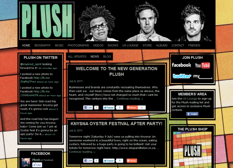
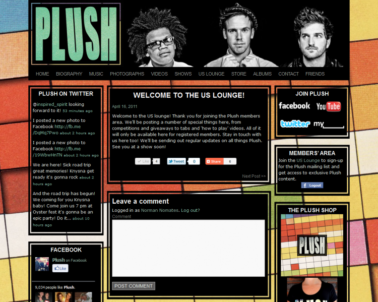
The home page displays a combination of official news updates and more personal blog posts written by the band, visitors can then click on a tab to isolate the content and only display one of the categories. The third category is for exclusive content in the members’ area. Any members-only posts are only visible to fans that join the US Lounge Members’ Area. The band will be able to use this area to reward their most dedicated fans with exclusive content.
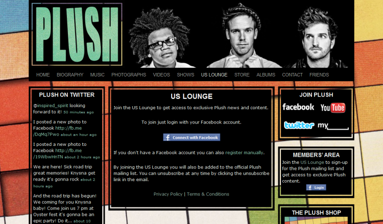
I made quite a few modifications to make the US Lounge Members’ Area an easy user experience. I used a Facebook Connect plugin that allows fans to create an account with two clicks. I made extensive modifications to the plugin to ensure that any new members’ would also be added to the phplist powered mailing list. Using phpCurl and inspired by Jesse Heap‘s work on the dual registration plugin I was able to seamlessly pass the users’ details to phplist.
After ages wrestling with Facebook Connect and the Graph API it became clear that Facebook doesn’t share any useful information about the user’s country. As Plush have fans around the world it is important to determine where their members are based. The data made available from Facebook is very unpredictable. The current destination field could be “Cape Town, South Africa”, “Cape Town, Western Cape, South Africa” or “Cape Town, Western Cape”. This format makes it a huge challenge to determine the user’s country. The solution I came up with was quite a task to implement. I created a new database table that lists every country in the world. If the last part of the user’s location matches one of these countries then that value is passed through. I then expanded the table to include states and provinces for a lot of countries. So if a user’s location is “Los Angeles, California”, the database will determine that they are based in the USA.
Aware that not everyone is comfortable with Facebook Connect’s one click login process, I added a manual sign-up option to the registration page. I used the phplist dual registration plugin to add phplist functionality to the default wordpress registration page. I also styled the page slightly to make it clear that the user was still on Plush’s website.
A collection of useful wordpress plugins help to make content really easy to manage.
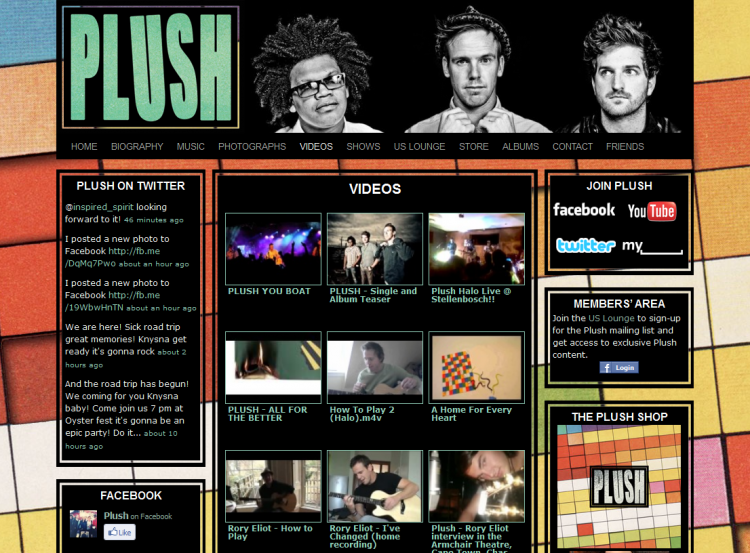
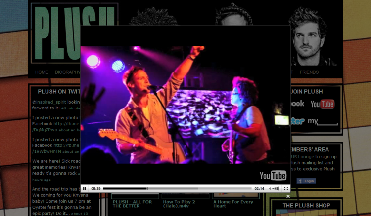
TubePress syncs with Plush’s YouTube account and automatically imports any new YouTube videos to the videos page and the latest videos sidebar widget.
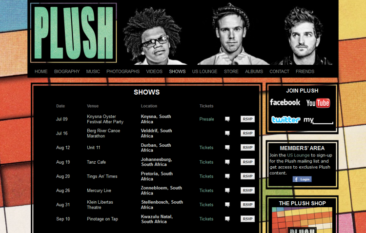
Bandsintown is a Facebook application that creates a tour dates tab on an artist’s fan page. The app also includes a wordpress plugin to list those dates on your website. With some additional styling I was able to integrate the band’s tour schedule into the shows page as well as a sidebar widget. Bandsintown also includes a myspace widget so Plush only have to update their facebook page to publish tour dates on their website and myspace profile simultaneously.
Twitter Widget Pro is a very simple WordPress plugin with enough classes to make styling a breeze. It was easy to add a list of Plush’s latest tweets to the sidebar.
FAlbum
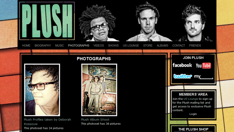
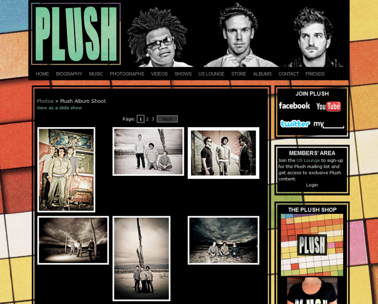
The Plush photo gallery is powered by a the FAlbum plugin which allows WordPress sites to sync with a Flickr account to dynamically create galleries in the website. I created my own template to make the site fit into the website’s style. The band only needs to update their Flickr account to keep the website current.
Custom FAlbum widget.
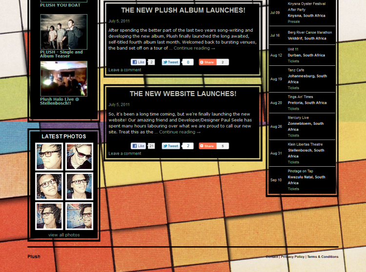
I wanted to display the latest photographs in a sidebar widget. I wrote my own custom plugin to work alongside FAlbum to display the latest thumbnails. The plugin is very basic but allows the user to set the number of photographs to display and includes a few classes to make styling easier.
Google Analytics for WordPress makes it really simple to add Google Analytics to a wordpress site. Having created an analytics account for Plush, I only had to add the site ID to the plugin to start recording the site’s traffic.
Admin Bar Disabler proved to be a simple but useful plugin. As the site encourages user registration, a lot of visitors would see the WordPress admin bar at the top of the page. The options for subscribers are fairly limited and I didn’t want users to find the admin bar confusing. I used the plugin to disable the admin bar for all users unless they have admin rights.
I used the standard WordPress text widget to add some html for more sidebar modules, including a Facebook like box and a store widget linking to merch and music.
The cms features built into the twenty ten theme make this project far more valuable for the band. They are able to easily customise the menu, changing the order, adding or removing page links (including external sites). The header photo and background image can also be replaced within the site’s cms, it’s really easy for an admin to upload new images for these sections.
All in all, the new Plush.us is a very powerful artist website; maximising integration with the social web, simplifying updates and driving data acquisition through fan engagement. The project took a long time, but the challenge allowed me to expand my development skills and explore the latest technology. I’m very proud of the end result.
