Stooshe Website
One of my biggest projects to kick off 2012 was project managing the development of Stooshe’s new official website.
Kate Brighouse did a great job designing the site before handing it over to me to brief Isle Interactive on the development.
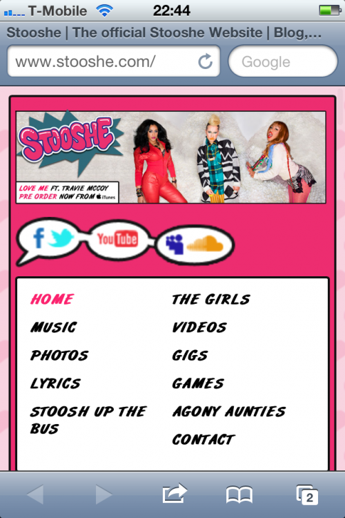
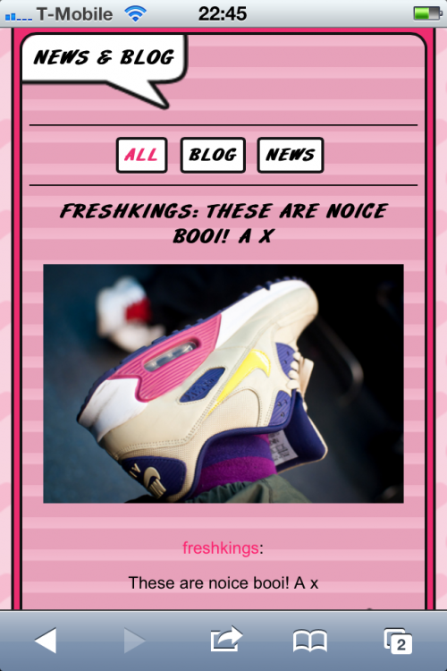
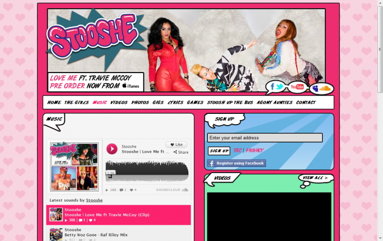
Stooshe’s target audience is very young so it was important for the website to be fun, colourful and mobile friendly.
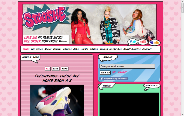
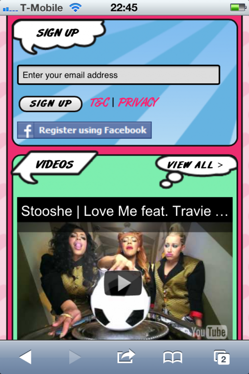
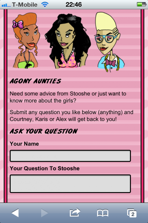
Andy Jones at Isle Interactive did an incredible job applying responsive design to the site’s layout. The website adjusts to provide the best views across desktop, tablet and mobile devices
Project managing and testing the site proved to be a massive task with lots of specific integrations. The responsive design also meant that I had to keep testing the site across multiple browsers and devices.
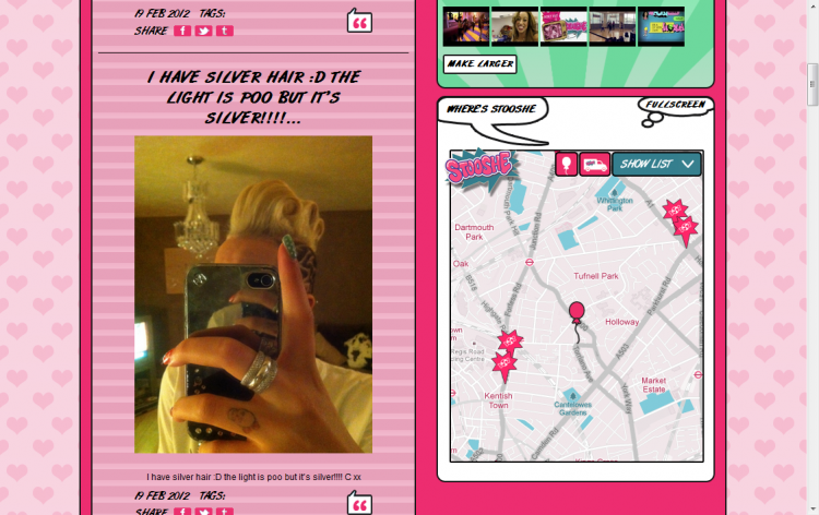
The sidebar includes a module for the Where’s Stooshe Web App, allowing fans to track the StooshBus and search for goodies without leaving the home page.
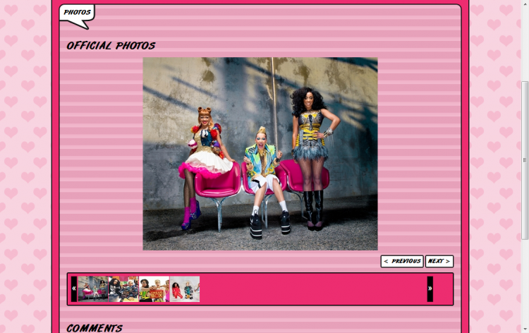
The StooshBus Racing game that I built is also integrated into the sidebar as well as modules for videos, photos and the mailing list.
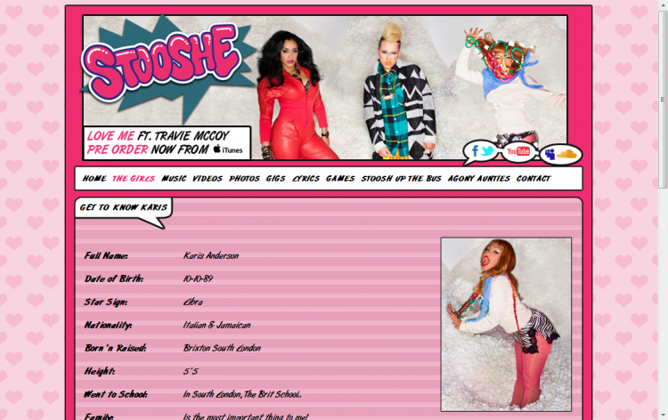
The website header acts as a prime space for marketing messages. I assembled a banner with rollover states on each of the girls. When you hover over them they react and switch to a crazy pose. To ensure that people are aware of the animation I added a timer that makes switches each of the rollover states on every few seconds.
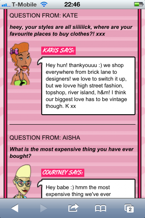
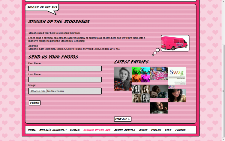
Additional features include an Agony Aunties section; allowing fans to submit any question to the group and a StooshUp the Bus feature where fans can submit photos to be included in the wallpaper of the StooshBus.
I manually added lyrics and profile pages for each of the girls. Bearing the responsive design in mind, I included CSS rules to ensure that the profile pages adjusted according to the user’s browser or device size.
The website was incredibly well received, driving more traffic on stooshe.com than any previous day. The interactive features continue to engage fans making the site a fun destination for repeat visits.
