NativeNoise.co.za Overhaul
The great irony of the web is that developers and designers usually put their best work into sites belonging to other people. That’s partly a case of focussing on paid work and partly wanting to do so much on your own site that it becomes an unmanageable project.
That has been the great tragedy of NativeNoise.co.za for the past few years. I did very well at keeping the blog updated with posts about my work in the UK section of Warner Bros Records, but the general design and functionality of the site was really showing its age.
With my new role being more strategic and less production-focused, I decided it was time to dedicate the time I would normally have spent updating the blog on redeveloping it instead.
A lot of my current work is less tangible and harder to showcase (either confidential or project management), so work updates will be reduced but I’d like to spend more of my time creating posts about my photography and general blogging. Let’s see how that goes.
Thus with a new focus comes a new site! Traditionally Warner steered clear of WordPress sites, so my theme development skills were admittedly rusty. I used this opportunity to refresh my knowledge and upgrade my skill set. It has been fascinating to learn about new hooks and methods for customising themes.
I was tempted to use a pre-built theme by Anders Norén called Baskerville. It is a beautiful theme with loads of options. The problem was that customising it with a child-theme ended up being counter-productive as I tried to undo functionality and create a patchwork of styles and functions to make it suit my needs.
Instead it opted to use Underscores to create a base theme and build it up from there. The framework spits out all the files you need to build a theme with absolutely minimal styling – perfect for my needs.
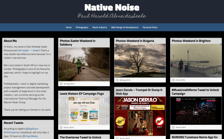
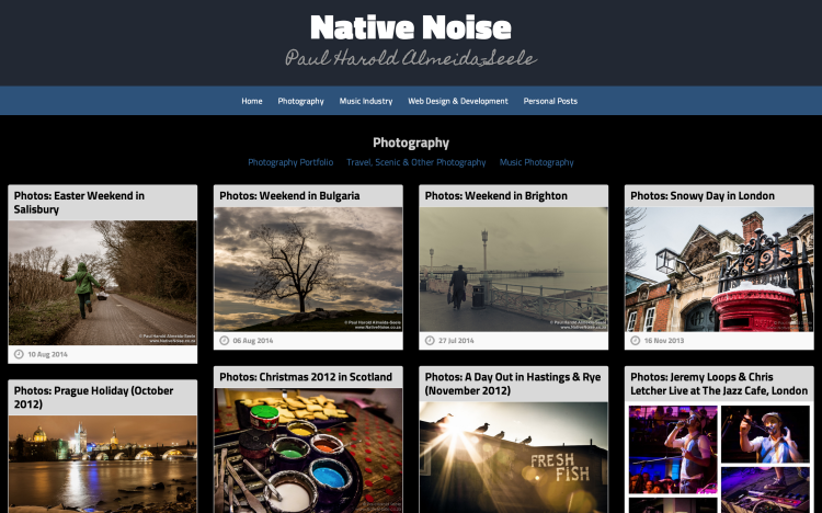
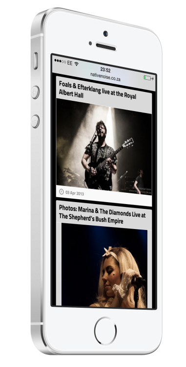
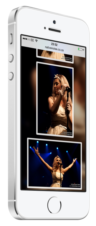
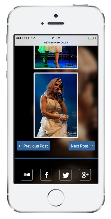
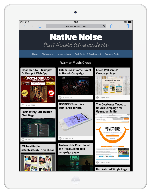
The old thumbnail gallery layout I used in my previous theme worked well so I decided on a responsive Masonry layout for the new design. It took some time to make it truly responsive and introduce enough media query breakpoints to ensure the site looks good on all screen sizes.
One of the challenges with redesigning a site is that the old content still exists, along with any strange quirks that may have been necessary at the time. My old Gallery theme relied heavily on custom meta tags for thumbnails and extra content. So part of modernising the site would involve batch updates and better ways to deal with these items.
To manage thumbnails I needed to reassign the old thumbnail image as a featured image. That would allow me to use the image at different sizes and in meta tags like Facebook’s og:thumbnail tag. I wrote a custom php script that accessed the database directly, retrieved the name of the thumbnail image for each post, found the original image ID and assigned it as a featured image to the relevant post. The script worked brilliantly and only had a handful of images that needed to be added manually.
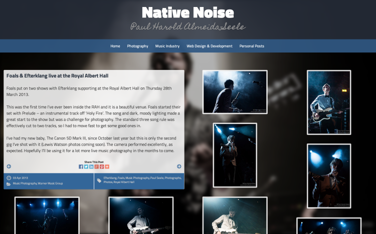
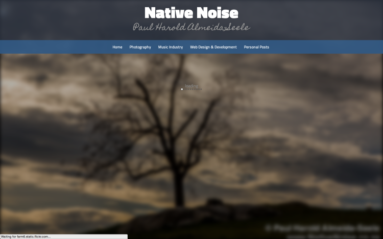
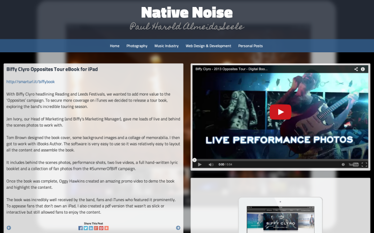
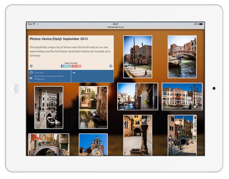
Having featured images on all posts now meant that I could use thumbnail images on the home and archive pages. I then chose to take it further and use the full size featured image as a background for each post. This gives each post some nice context and makes them all unique. I didn’t want the background to be distracting or horribly pixelated on larger screens so I added some CSS blur and a little opacity to make the images look great in the background. I feel that this works particularly well on photography posts.
The other new feature I decided to make the most of is post-types. This allowed me to create a custom template for gallery posts. If I classify a post as a gallery, the template will automatically append all the post’s uploaded images in a large responsive layout alongside the written post content.
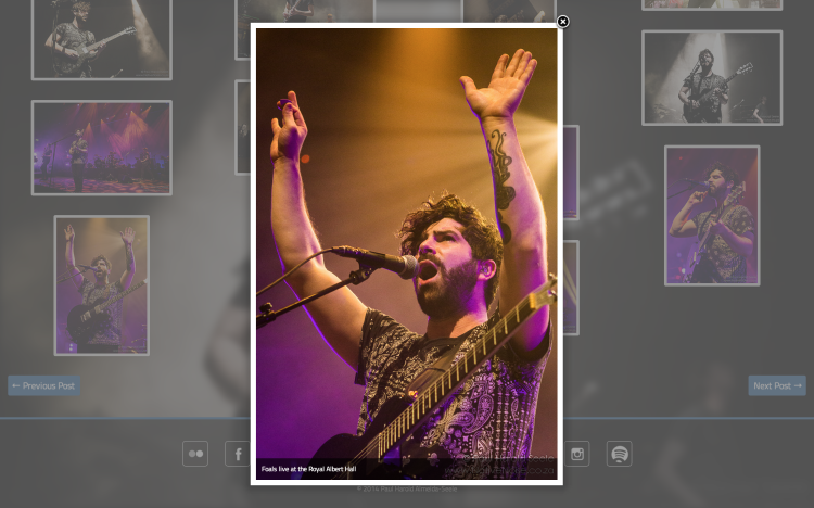
I’ve been bedded in with Flickr for a number of years so it made sense for me to continue using the service to host my photo albums. Obviously I still wanted that to seamlessly integrate with the website. Previously I used Dan Coulter‘s Flickr gallery plugin but he has stopped supporting that and it broke after Flickr switched to only accept requests over SSL. I found a great interim plugin called Flickr Photostream by Miro Mannino. It does a great job laying out images in a justified gallery, much like Flickr’s own layout. However, the justified layout didn’t quiet work with my new masonry design and background images, so I developed my own alternate version of the plugin, arranging the photos the way I wanted and using Fancybox (rather than the built-in lightbox methods) to display larger images.
I also wanted to cut back the number of plugins I used and did well to integrate a lot more functionality through my theme’s functions file.
All-in-all I’m very happy with the new site. It certainly feels a lot more modern and I’m glad I was able to work around all my old content without a lot of manual edits. I’m sure I’ll be tweaking things and improving it, but as long as I keep adding content it is an online home I can be proud of once again.
