One Pound Fish Man Official Website with Twitter Visualisation
The madness around the One Pound Fish song made it a great project to be involved in. Warner only signed The One Pound Fish Man in early December so we had a few short weeks to quickly get assets together for the release.
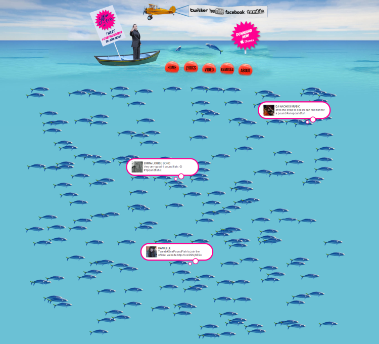
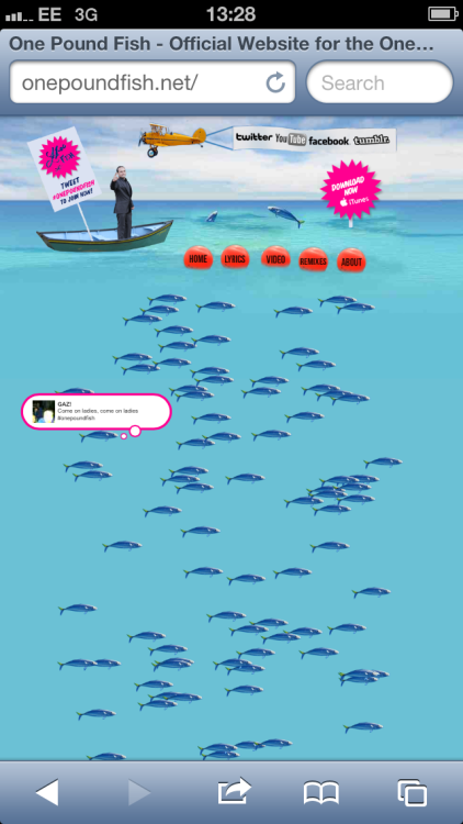
To strengthen his online estate I set-up https://onepoundfish.net and built a simple but appropriate website. The home page features a fairly unique Twitter crowd where every tweet containing #OnePoundFish or #1PoundFish would appear on the page – as a little fish with a thought bubble.
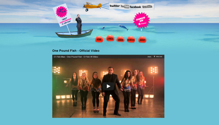
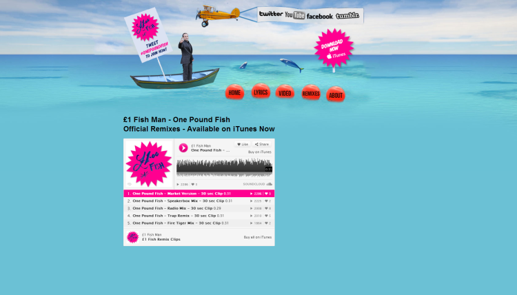
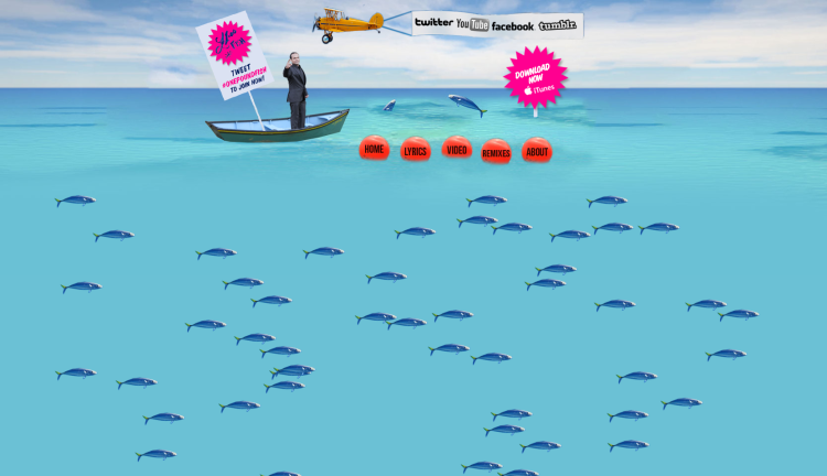
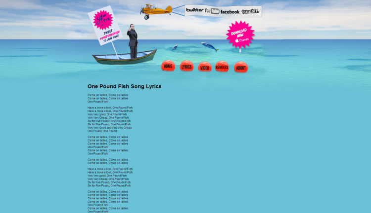
Kate Brighouse designed a spectacular ocean scene with the One Pound Fish man standing in a boat at the surface.
I wrote my own jQuery script to fetch the search results from Twitter and keep polling for new results every 30 seconds. The jQuery implementation meant that Twitter’s rate limits are applied to each end-user rather than the site’s server.
The script would then calculate a random x and y position within the page and place each tweet using a simple jQuery animation. As a fish gets placed on the page the accompanying twitter username, profile picture and text would briefly fade in as a thought bubble before fading out again. Hovering over a fish will reveal the thought bubble again. I created the thought bubbles using this css trick from Nicolas Gallagher.
To round off the effect I used the excellent jqFloat plugin to make the fish, boat and bouys continually float on the screen.
To keep visitors engaged and on the page I used the jQuery Popup Window plugin. Thus, clicking on a fish will open the original tweet in a popup window. Clicking on the boat will open a window with a pre-populated tweet using #OnePoundFish and a link to the website.
The site worked incredibly well to visualise and encourage conversations around the song in a fun and silly way.
